Animal project: part two
I am so glad that the first part of the project is finally over! The next part is much more interesting for me especially because I am going to learn something that I have never done before. Illustrator!
This is a little scary but I do want to take up the challenge of doing it! So my first plan of action before I do anything would be to go through the tutorial and a few videos on YouTube that would help und rest and the application better.
After doing this, I spent sometime going through a few thumbnails.
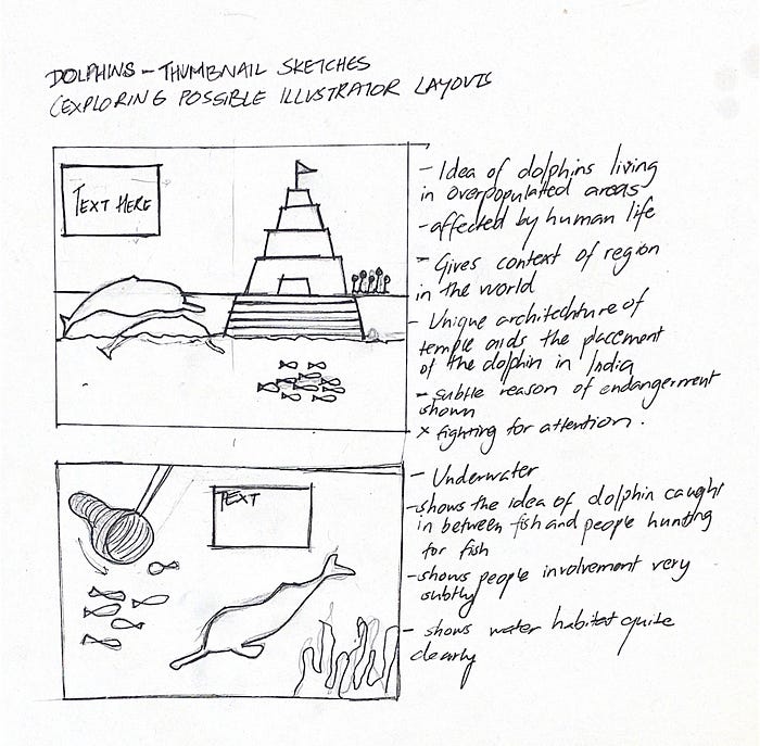
These were the two thumbnail sketches that I came up with. When I was sketching these, I wanted to capture the reasons that the Dolphins were dying. There are two main reasons:
- The densely overpopulated region in which they reside. On the river banks of Ganga, there are Hindu temples and a lot of the visitors take baths in the river. This intoxicates the river and disturbs its habitat
- Often times dolphins come in the middle of fishermen trying to catch small fish, which is also the Dolphin’s prey. So they get caught in the net.
These two ideas are reflected on the thumbnails that I did.
Critique on the Thumbnails
The first thumbnail
- There’s too much happening
- The combination of underwater above water would be really hard to show
- The importance of the dolphin would be lost
- The whole thing is really flat
- I could probably reduce the size of temple and move it further in the back.
The second thumbnail
- The composition is well established
- The text placement should be thought about
- The colour scheming of the thing with just the seven colours can be a little tricky
- The composition explores depth — which is good
With the critique I have received, it’s obvious that I should work with the second thumbnail sketch. And that is what I will work with!
I wanted to look at underwater dolphin reference images.
To explore the idea of depth and underwater composition, I first sketched it out.
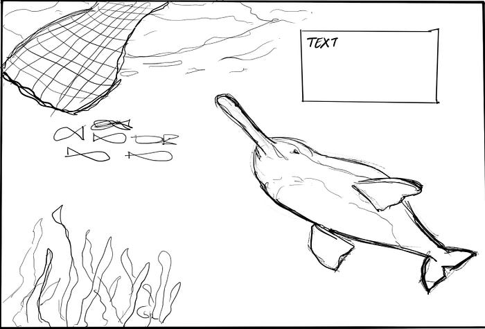
Composition 1

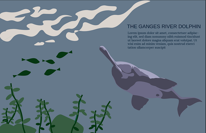
COLOUR CHOICE
Working with colour was a very important part of this iteration. I wanted to take into account of how each colour palette was responsible for the putting forward a message and an emotion.
Connor gave me the idea of working with the yellowish green colour palette to give off the impression of the intoxication of the river. However I did want to try the bluish colour palette as well. This was to make sure that this was not something that I wanted to explore further.
I may want to stick to the yellowish green colour palette though because aesthetically I believe that it works well too.
Personal Reflection
I do understand that this project is far from over. I understand that this is not something that I am looking for in terms of resolution and skill. However, I believe that I have surprised myself with the progress I have made. I literally did not know how to use illustrator before I started this iteration. I believe my learning curve was really steep, and I have taken a large step forward in growing this new skill. Unfortunately, because of the slow pace that I was working with, I did not have the time to work with
Critique
I spent a lot of time getting feedback for this first iteration
Daphne’s feedback
- The green definitely works better — both, in terms of aesthetics and the message that I want to portray
- The plants are too simple — work on making this better
- Impressive use of colour in terms of the limitation of only using 7 colours
- Work on the details of the dolphin — looks like it is image-traced
- The fish also lacks a lot of detail
- Think about perspective. Would the stone actually be visible from that perspective.
Q’s feedback
- You would need more margin on the right with the body of the text. The text body copy requires more space.
- He suggests that I think about the perspective that I chose again considering my experience with illustrator. This perspective is difficult to pull off
- Think about how to make it seem more like water ripples. Either need to revise form or indicate highlight/shadow by adding one more colour.
- Too much contrast between your dolphin and the fish. They should not be as simplified as you have them. Put more effort on to them!
- Too much contrast between your dolphin and this. I would not say these are simple.. You need to put more effort when giving form
- Your plant looks like cartoon!
- I achieved the contrast between the title and subtitle by using different font and size. Is all caps necessary for the title? Plus, I need to add a sub-title.
Margot’s feedback
- Work on the text that I am going to have
- Explore the pencil tool
- Play with the balance of the detail, try and remove the number of anchor points that you have for the high-lights
- Change the perspective! It’ll help me a lot.
OKAY THAT WAS A LOT…
GOALS FOR NEXT ITERzATION
- Write the text
- Change the perspective of the whole composition
- Play with colours a little more and the negative space of the composition
COMPOSITION 2
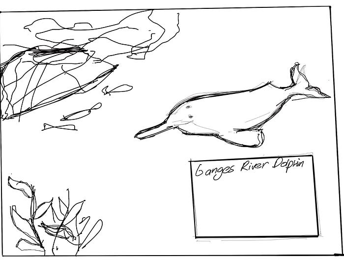
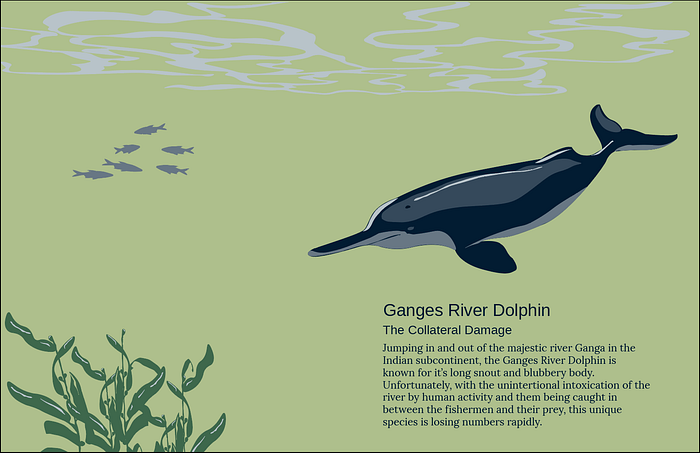
The screen shot was taken a little after the critique I got for this and changed it a little bit. The unchanged imagine the ripple on the top, squeezed only on the left side and the highlights on the dolphin’s would much sharper.
I am really happy with this. Again there’s still a lot to do with this. But I like the Dolphin’s rendering. Again, I did not have the time to come up with the fishing net. The smaller fish have a more realistic form that it follows. And there is the text that I added which puts the composition into context.
Critique
- The details for the dolphin is really nice
- The composition is really segmented into 4 different corners, and it seems really simple
- The colour composition looks really nice.
- The plants look really nice but they need more details — possibly shadows
- Add details to the fish
- The ripple effect looks really nice
- The perspective is off (with the ripple squashed to the left)
- Add the riverbed — it would help with perspective issues
Goals for the next iteration
- Add the river bed
- Work with the perspective of the composition
- Add the net to show the reason of endangerment
- Work with the details of the kelp — add shadows
- Try and make the composition more dynamic and not look as if it was divided into four parts
For the next iteration

I have a good feeling that I am reaching closer to my final version. I finally added the net to my composition. I added the river bed. I worked a little bit with the shadows on the kelp and check how that was working out. I am a little bit concerned about how that is looking. The composition has changed to look more dynamic than it was before.
Critique
- The net was really appreciated. Captures the required flow of water
- The over all composition is more dynamic and well thought of
- Rethink the colours on the smaller fish
- Work on the shadows of the Kelp
- The ground line was a nice addition but increase it’s height. That would really help set things in perspective.
- Think about the height of the plants in the background and the amount of detail you put on them — it looks cloned and copy pasted
- The details on the dolphin are really nice but because of it’s size, it still does not feel as if it is the star of the show — increase the size
- Play with the placement of the text and the reduce the size of the body copy
Goals for next iteration
- Work with the size and placement of the dolphins
- Work with the coloration of the fish in the background
- Reduce the size of the body copy of the text and try experiment it with the placing of it
- Work with the plants int the background and increase the height of the ground line
- Shadows on the kelp are very accented, try and tone it down
WORKING WITH THE CRITIQUE
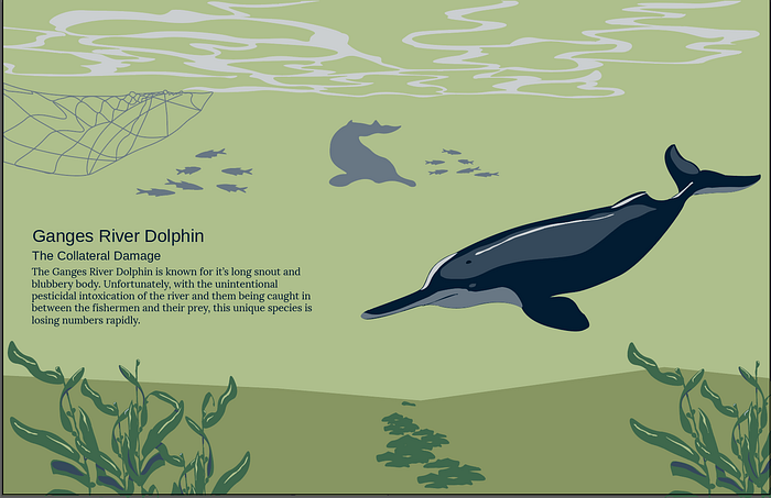
As you can see, I made quite a few changes for this iteration. I changed the ugly kelp in the background to a few stones. I made the dolphin larger and to play with depth, I added another Dolphin in the back. I reduced the body copy of the the text and changed the placement of the text. I even changed the tone of the shadow of the kelp. I personally like this composition a lot better.
Dani’s Critique

- Dani loved the net as well
- The dolphin at the back helps add dynamism to the composition. It leads the viewers eyes from the background to the foreground. However I could make the form of the dolphin at the back more rigid
- Think about increasing the size of the main Dolphin.
- The schools of fish look nice
- Think about the rag of the body of the text and try and fix that
- Add more texture to the river bed
Goal for Final Iteration
- Add texture to river bed
- Change body copy of text
- Fix background dolphin and change size of the main dolphin
FINAL ITERATION

